Kiteboards: Custom Designs
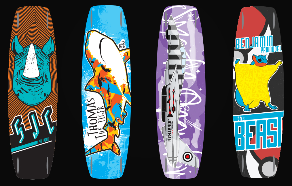
So when I say I can design pretty much anything, I mean it and here is some further proof. These projects were a ton of fun to do. I was able to have a ton of artistic freedom in the designs and basically go buck wild. The boards also gave me a chance to really dive back into the world of illustration, which I haven’t done too much of in a while. I wanted each board to be truly unique as well as different but the same from the others.
 Benjamin’s Board
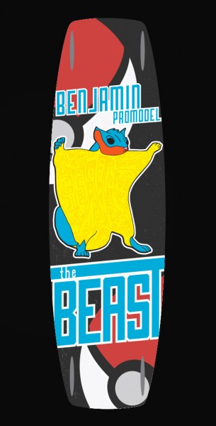
Benjamins board had three requests, a flying squirrel, red, and text that said “The Beast”. I created a “beastly” flying squirrel that had a tribal tattoo design on his stomach. The kiteboards would be ridden primarily in Hawai’i so it fit that the squirrel had a tribal tattoo design. Later in the design I found out that Benjamin was a HUGE pokémon fan so I added that to the design by including the poke-balls in the background.
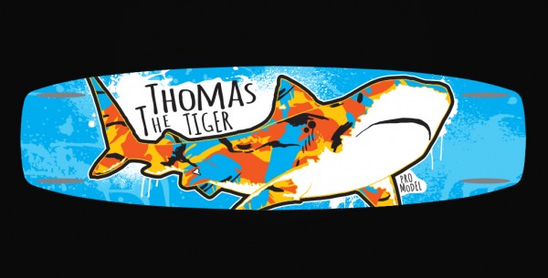 Thomas’ Board
This board had two requirements a shark and the text “The Tiger”. Of course I naturally went to the tiger shark for two reasons, the first is obvious but the second is that Hawai’i is known for it’s tiger shark population. The reason the tiger shark has it’s “tiger stripes” is that they act as camouflage. I wanted to juxtapose a realistic looking illustration of a tiger shark with a very abstract and colorful camo pattern.
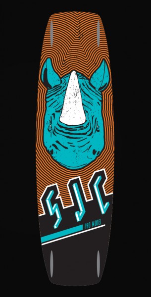 Sam’s Board
This board had three requests as well; to include a rhino, orange, and his initials in the design. I wanted the rhino to have a stylized approach but still have some realistic qualities. I also wanted the colors to have a high amount of contrast. The orange pattern came from researching skateboard designs of the late 80’s. The boards of that era really relied on bright, high contrasting patterns.
Jonathan’s Board
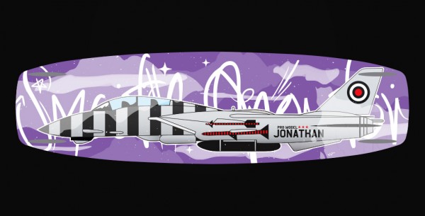
This board had three requirements, a jet fighter, the color purple, and the text “Smooth Operator”. I kinda went in a little different direction with this illustration. The previous were a little more hand drawn feeling while this is all strictly vector and detailed. I did want to have a bit of an outside of reality feel to the design, hence the graffiti like text and purple “sky”.
